Self-Published by Design: Building a Crystal Tracker from Scratch
Most tracking tools focus on efficiency. This one is designed for reflection. I created a physical system to help crystal collectors remember, engage with, and build a more intentional relationship with their collection—without relying on scattered apps or overly “woo” journals.
The Problem
Crystal collectors often want a more intentional relationship with their collection, but existing tools don’t support that.
Digital trackers are fragmented and transactional, while physical journals tend to be cluttered, overly decorative, or poorly structured—making consistent use difficult. As a result, people start with good intentions but struggle to maintain any meaningful tracking habit.
What I did
I designed and self-published a structured tracking system from scratch.
I researched existing tools, gathered informal feedback from collectors, and analyzed how people were currently attempting to track their collections.
From there, I defined the structure, designed the layout system, iterated on usability and tone, and refined the product through multiple versions based on real-world use.
Key insights: People don’t need more tracking—they need meaning and continuity.
Most existing tools prioritize storing information, but users care more about remembering context—where a crystal came from, why they chose it, and how it fits into their life. Digital tools felt misaligned with this goal. Users wanted something slower, more tactile, and easier to return to over time.
Solution
I designed a physical tracking system that balances structured logging with guided reflection.

The book uses consistent layouts, clear hierarchy, and intentional prompts to support both organization and personal meaning.
Key features include:
- Reusable crystal log spreads for consistent tracking
- Guided reflection prompts to deepen engagement
- Monthly check-ins to support habit-building
- Supporting pages for intention-setting and future planning
The overall design emphasizes clarity, restraint, and usability—avoiding the overly decorative style common in this space.
Structure & Flow
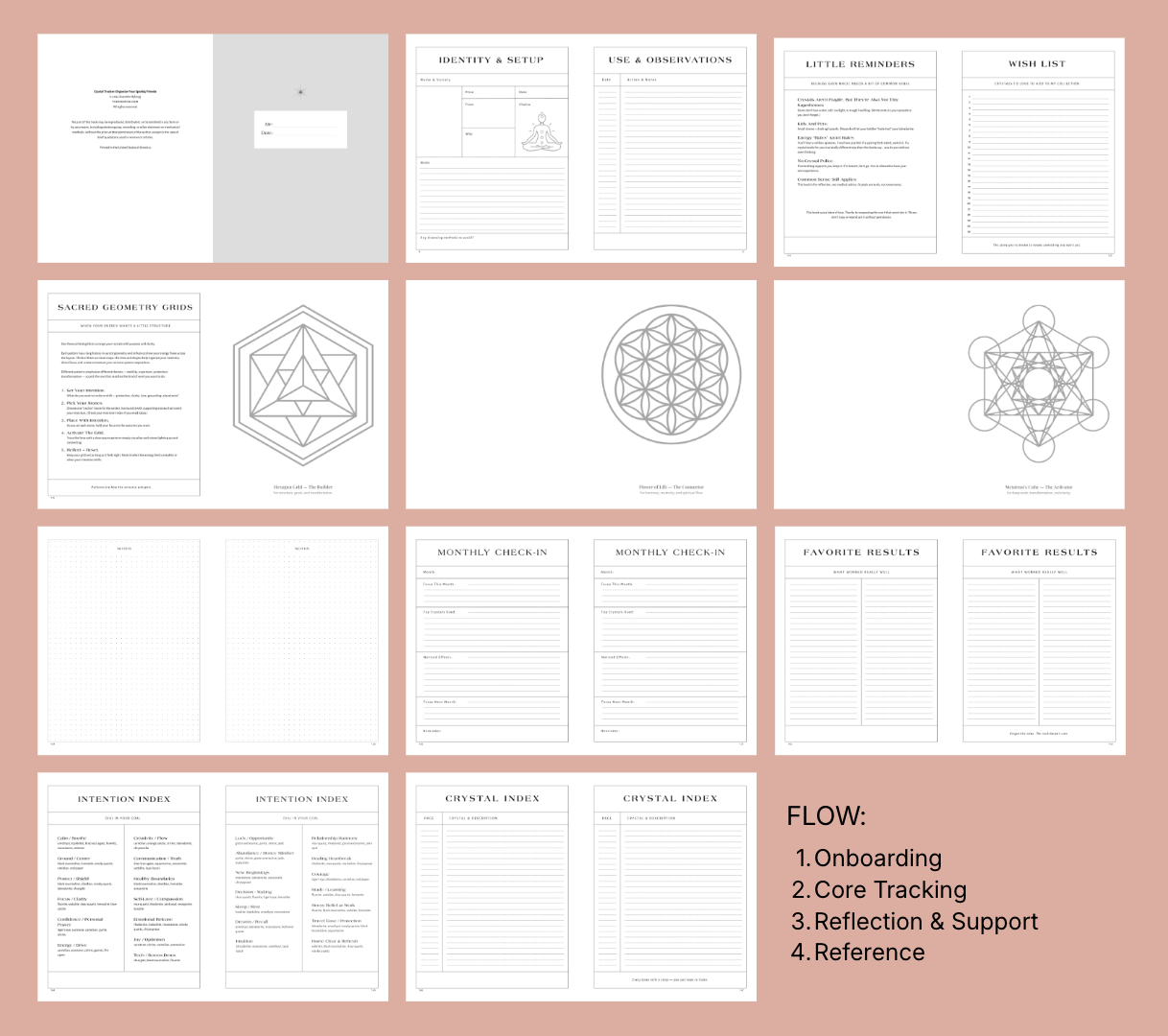
Early versions front-loaded planning and reflection, which slowed users down before they could start tracking.
I restructured the book to prioritize immediate use—moving supporting sections to the end so users can begin quickly and return to reflection when they’re ready. This results in a clearer, more intuitive flow that supports both consistency and depth over time.
Outcome
The final product is a cohesive system designed for repeat use, not one-time completion.
Early feedback showed that users valued the combination of structure and reflection, particularly the guided prompts and consistent layout.
A second iteration strengthened hierarchy, improved usability, and introduced features that better support long-term engagement.
What I learned
Designing for behavior is different from designing for use. A tool can be well-designed and still fail if it doesn’t align with how people want to engage with it over time.
This project reinforced the importance of structure, tone, and pacing in creating something people return to—not just something they use once.